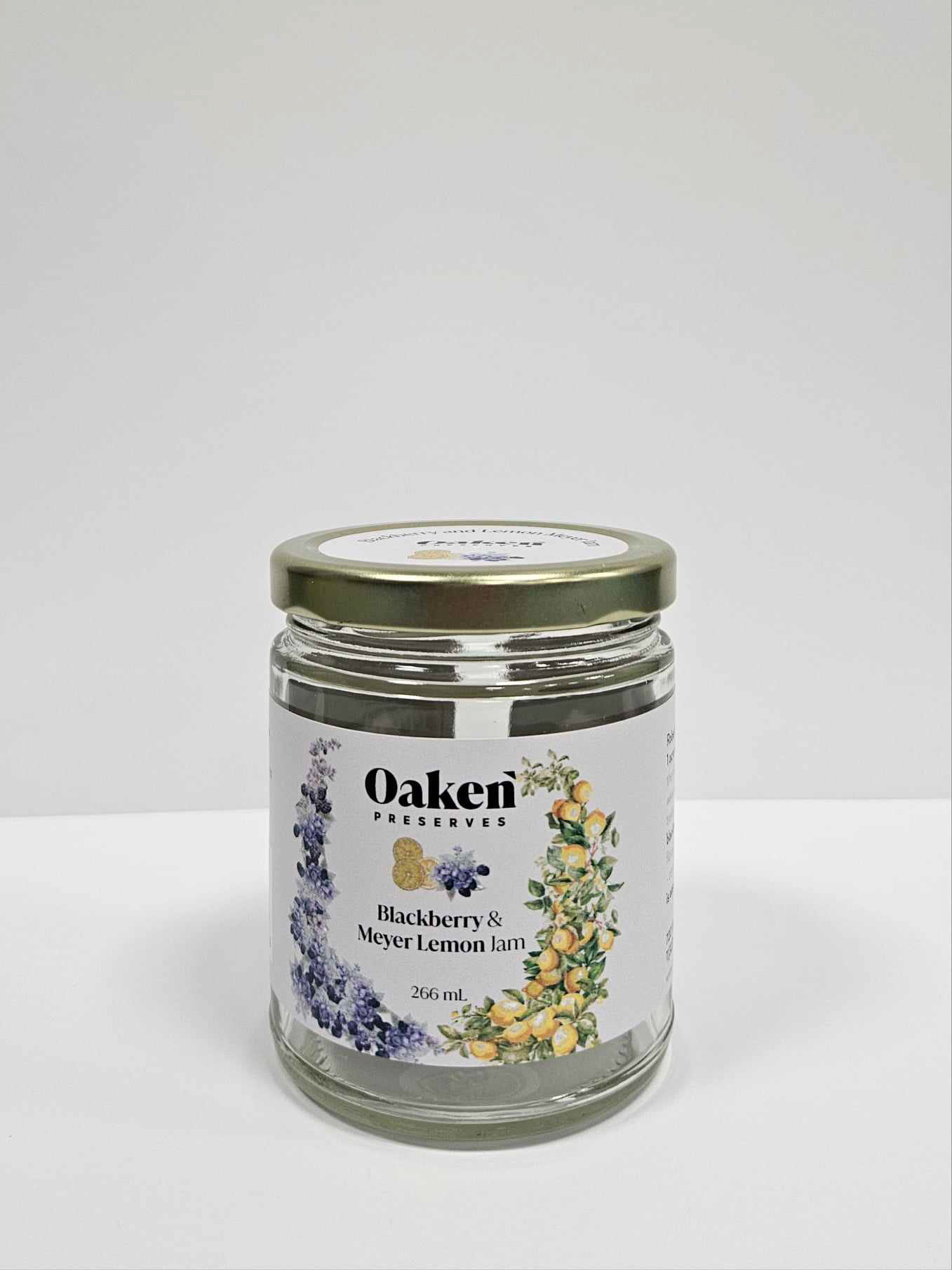
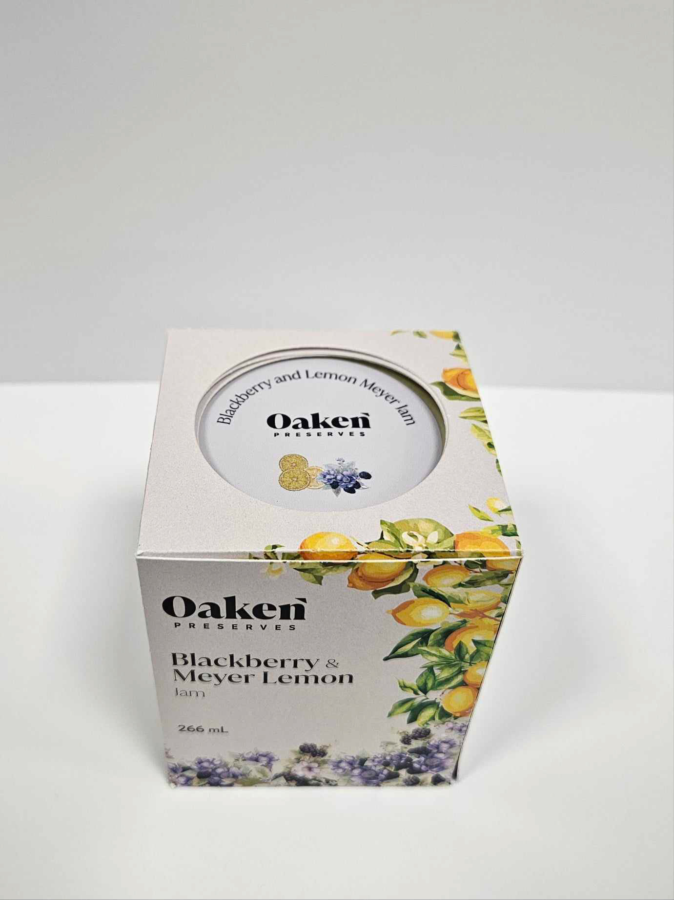
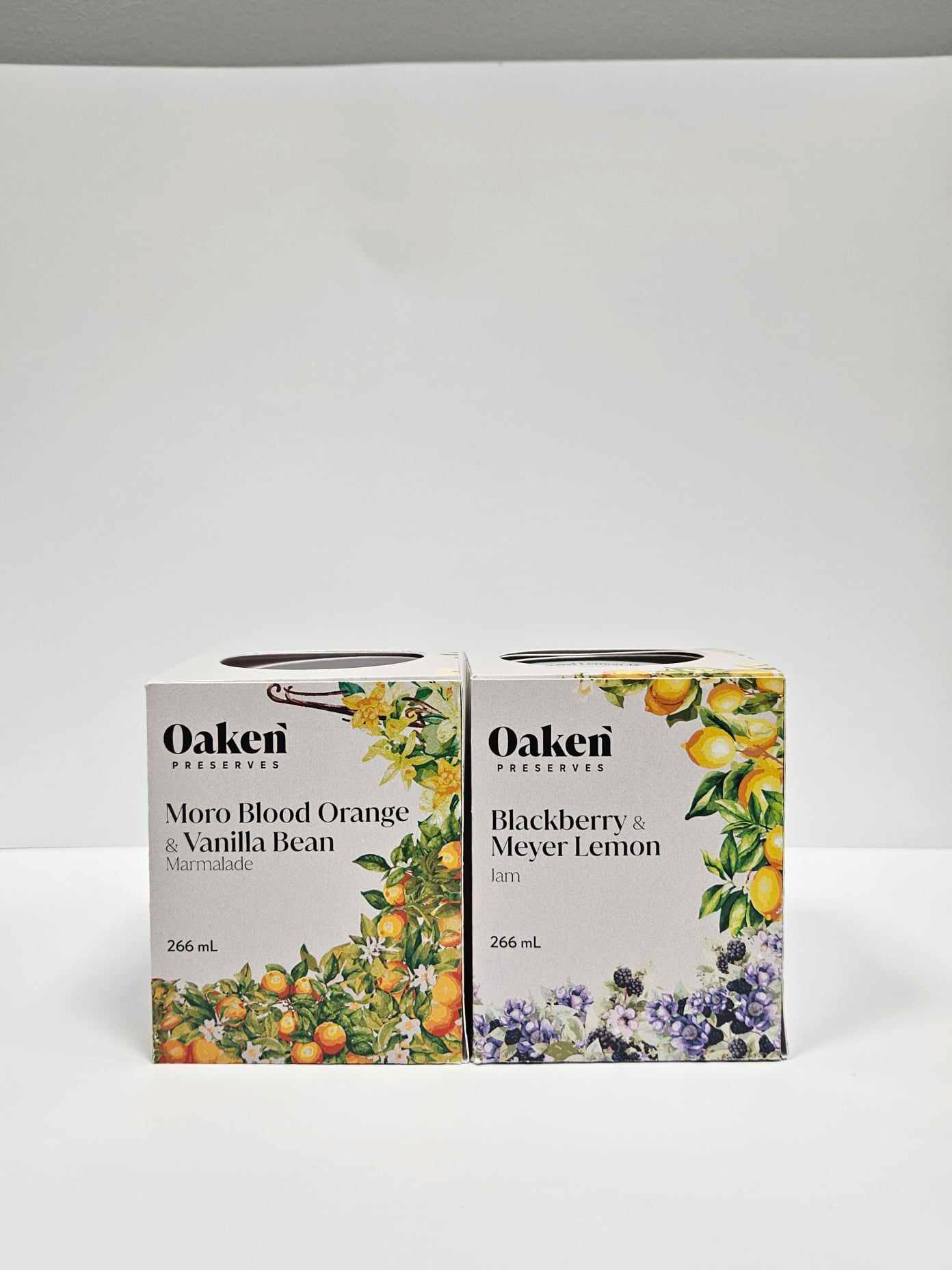
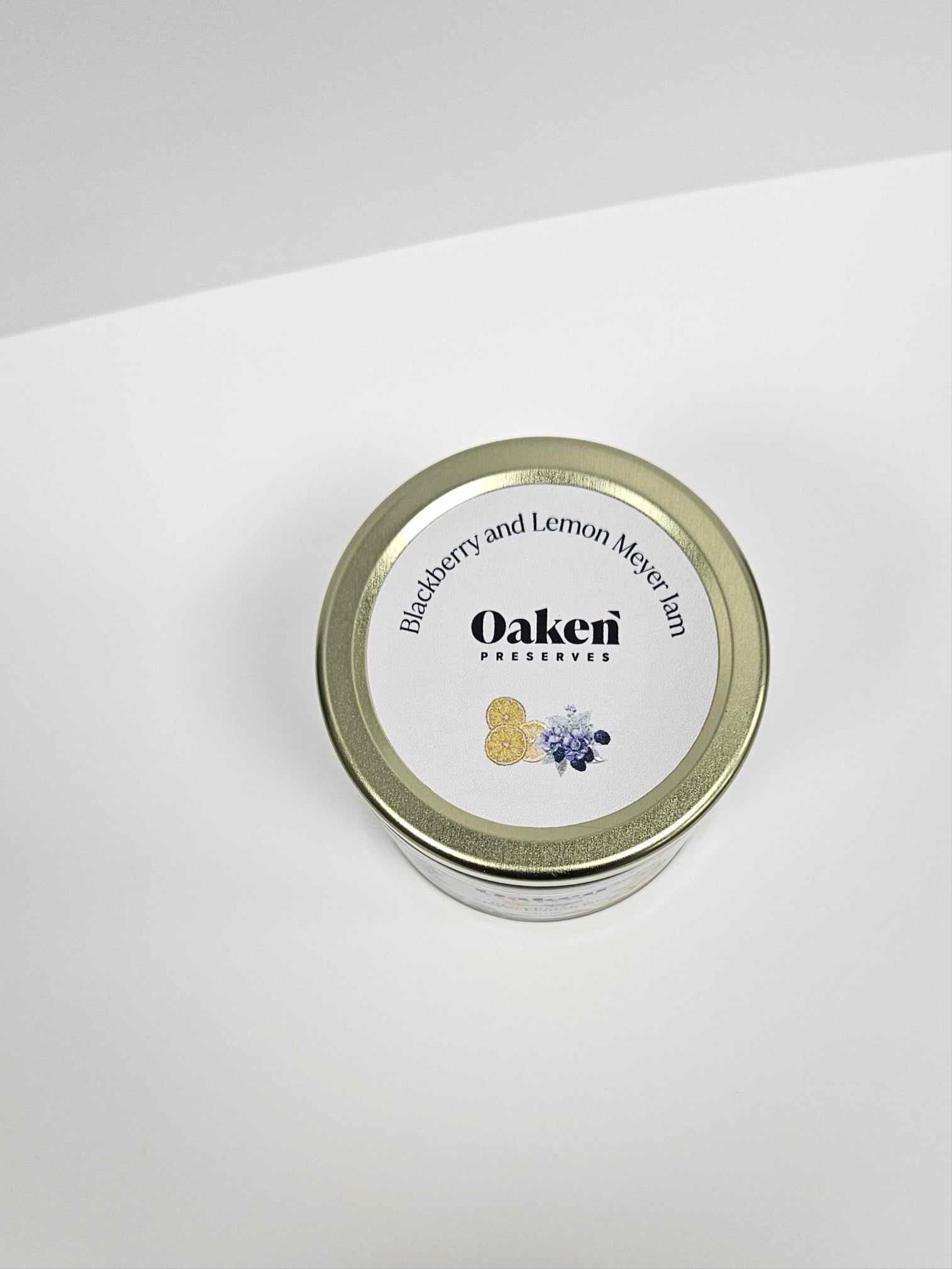
This is packaging designed for jams. The first two images showcase the blackberry-meyer lemon jam flavour, while the third and fourth images feature the blood orange-vanilla bean marmalade. The box includes a cut-out at the top to display the jar's label, ensuring visibility while maintaining the structural integrity of the packaging.
The illustrated style is intended to evoke a handmade feel, reflecting the brand's origins as a small, trusted, organic business. At the same time, the clean and minimalist aesthetic aligns with modern design trends. The label’s rounded corners were specifically chosen to mask potential imperfections or slight misalignments during application to the jars.
This packaging below is for Buffalo Coffee, available in two options: Ethiopia or South America. The design is compact, modern, and simple yet elegant, featuring gold coffee bean and plant outlines in brown to convey a sense of quality and sophistication. At the same time, it maintains an approachable feel with the interior box texture that feels handmade, emphasizing the brand’s dedication to providing exceptional coffee.
The design brief specified avoiding generic elements like coffee cups and beans. Instead, the variations are distinguished by the flavors and the maps illustrated on the box. The packaging style is a double-walled inner box with a cover that is glued at the bottom and wraps around the sides. A badge-like circle is placed in the center to enhance the handmade aesthetic, complemented by the old-paper texture used for the inner box.


